Branding & identity | Nonprofit
Purpose Built Communities
Purpose Built Communities® is a nonprofit working to transform communities of concentrated poverty in cities across the U.S. and wanted to establish itself as the leader in neighborhood-focused, resident-centered revitalization. However, it faced several roadblocks. Siloed marketing efforts, low brand visibility and confusion around its business model led to a fragmented and incomplete story. With a new, ambitious 5-year strategic plan completed, it was imperative that the organization get its house in order with a brand that could carry it into the future.
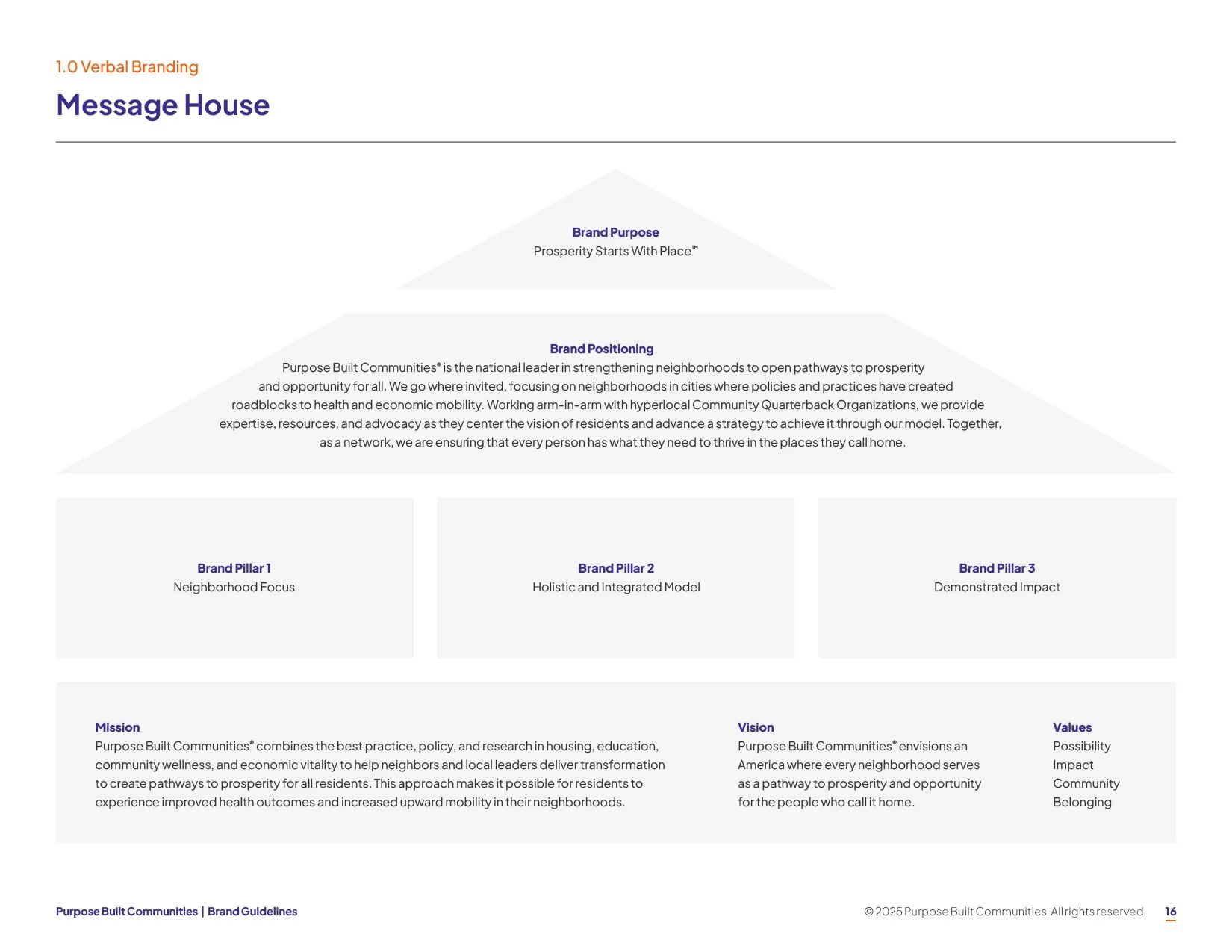
Our brand work began with in-depth audience research, landscape and peer analysis, and logo and messaging exploration. Knowing stakeholder engagement was key—not just among the Purpose Built Communities team, but also the Network Members that were critical to the success of its model—I worked with our research team to conduct immersive brand workshops and moderated meetings where leadership, employees, and Network Members could share input and ideas. From there, I helped to produce comprehensive brand guidelines, including a bold new visual identity to help Purpose Built Communities break through and a robust messaging framework to help them effectively articulate their work, their model, and their impact to key audiences.
With the new brand in hand, we activated a comprehensive comms plan, including counsel on how to navigate an unfavorable funding environment. From assisting the organization in launching its Inaugural Impact Report to establishing a strong executive presence, we helped Purpose Built Communities further its work in strengthening neighborhoods to create pathways to prosperity and opportunity for all.
5 Network Members added since 2024 | Atlanta Business Chronicle's Women of Influence | Forbes Nonprofit Council
team
Creative Director: Kate Bredimus
Art Director: Laura Svites
Designers: Laura Svites, Bronwyn McNully, Jennifer Malvagna, Kellen Salvo
Research
I firmly believe the best creative is backed by evidence and starts with a deep understanding of the people it's designed to reach. For this project, research was the foundation of every decision we made. Below are a few examples of how I used those findings to shape the final brand.
Landscape analysis
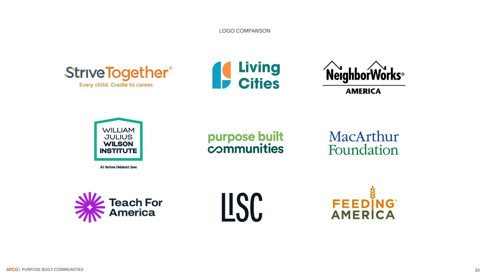
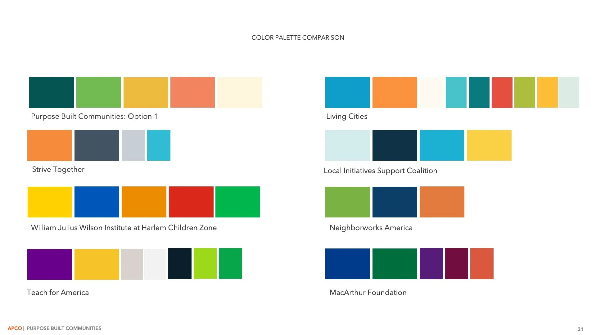
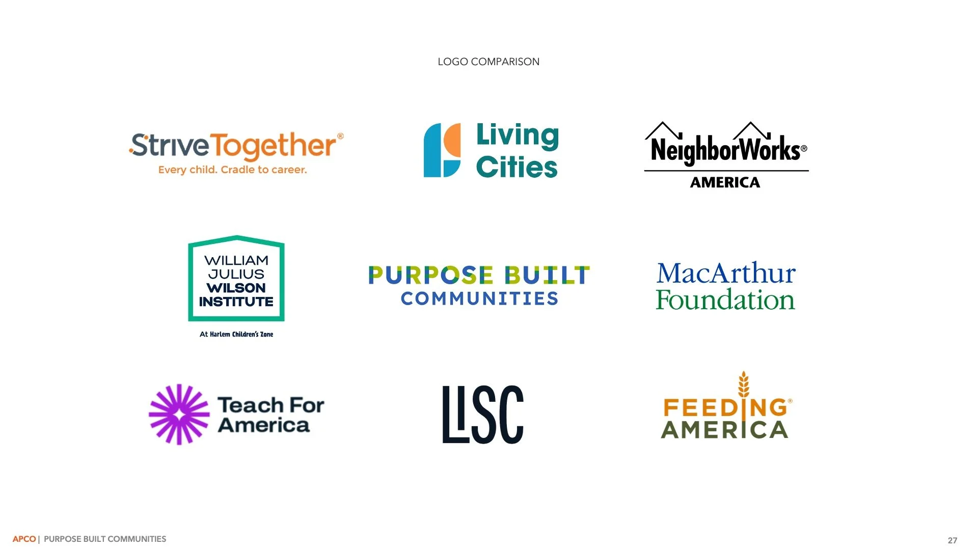
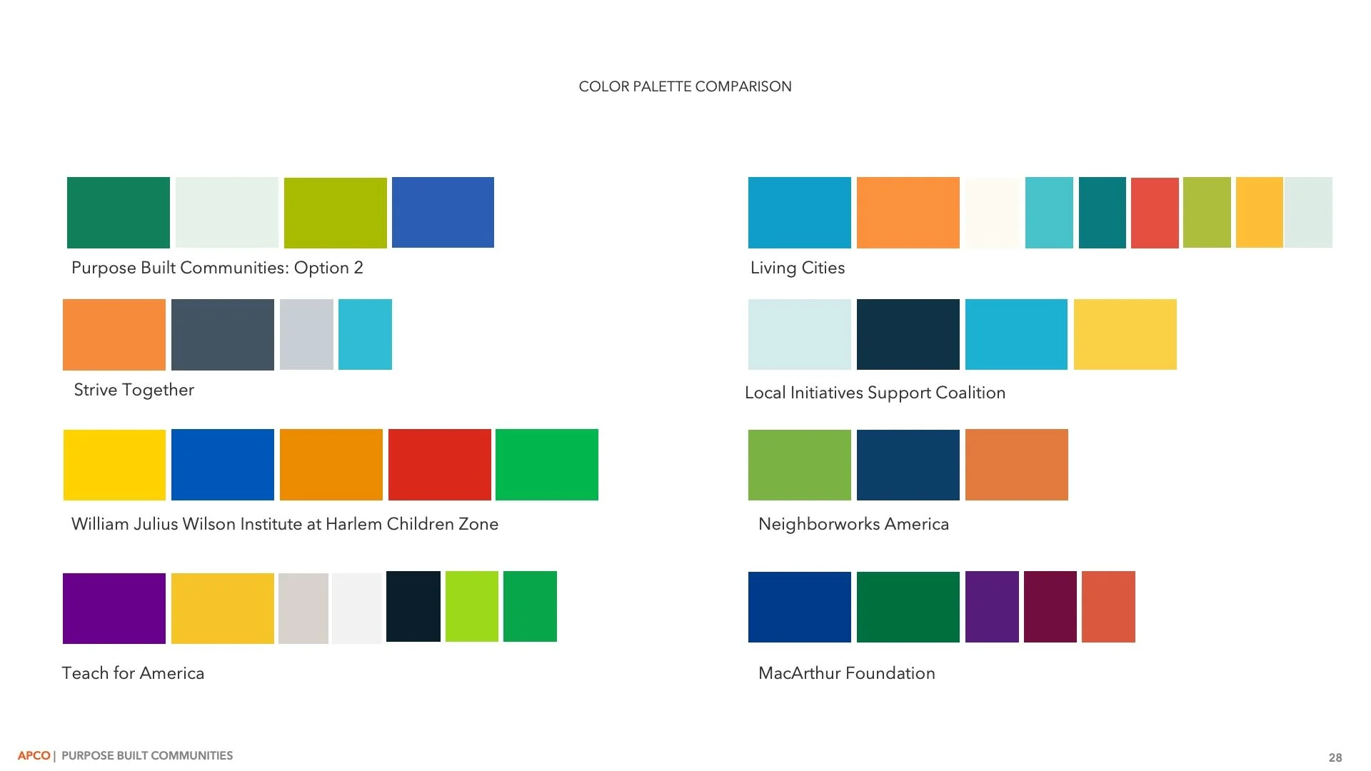
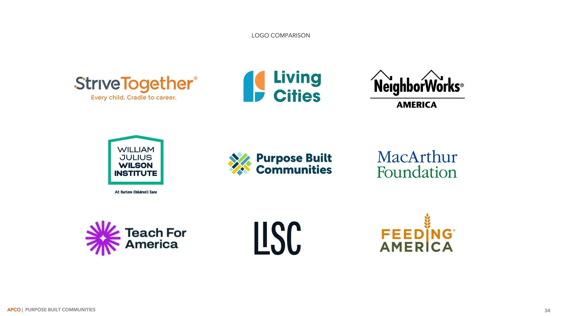
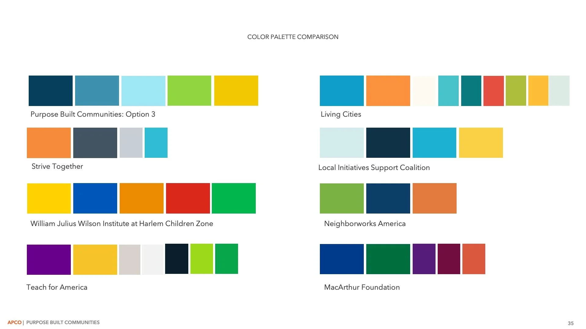
Our landscape analysis explored how Purpose Built Communities was currently showing up compared to its peers, the conversations shaping the field today, and the expectations of key stakeholders. I examined the visual identities of their peers, including logos, color palettes, and design systems, to better understand industry conventions and pinpoint opportunities for the brand to differentiate itself. These insights informed the direction of the rebrand and helped identify opportunities to increase awareness, differentiation, and clarity.
Qualitative research
I collaborated with APCO’s research team to develop discussion guides that explored awareness and perceptions of place-based partnerships, perceptions and expectations of Purpose Built Communities, brand promise, purpose, and emotional connection, and brand expressions and tonality assessment. We used these guides to moderate one focus group with federal policymakers and 23 in-depth interviews with our key audiences.
Audience Profiles
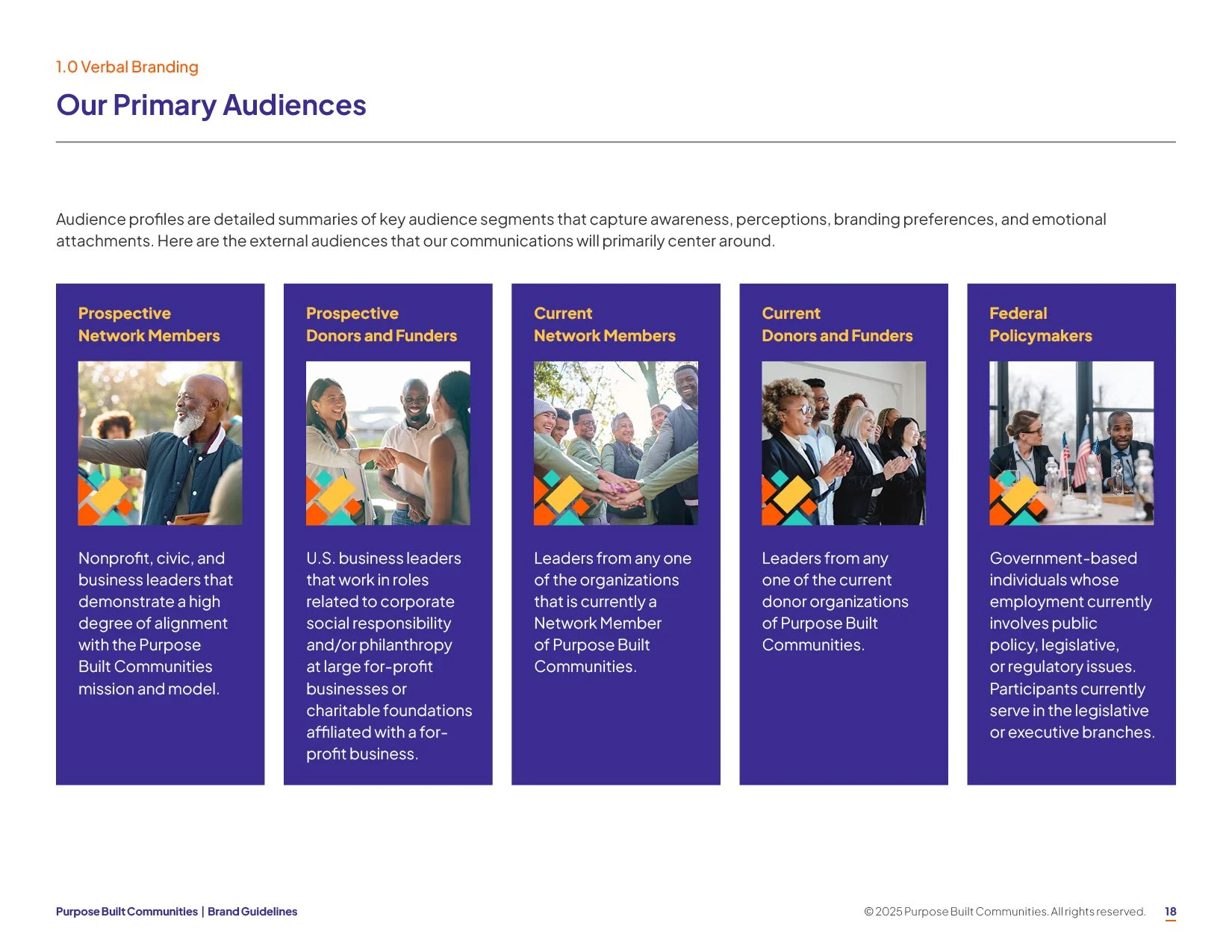
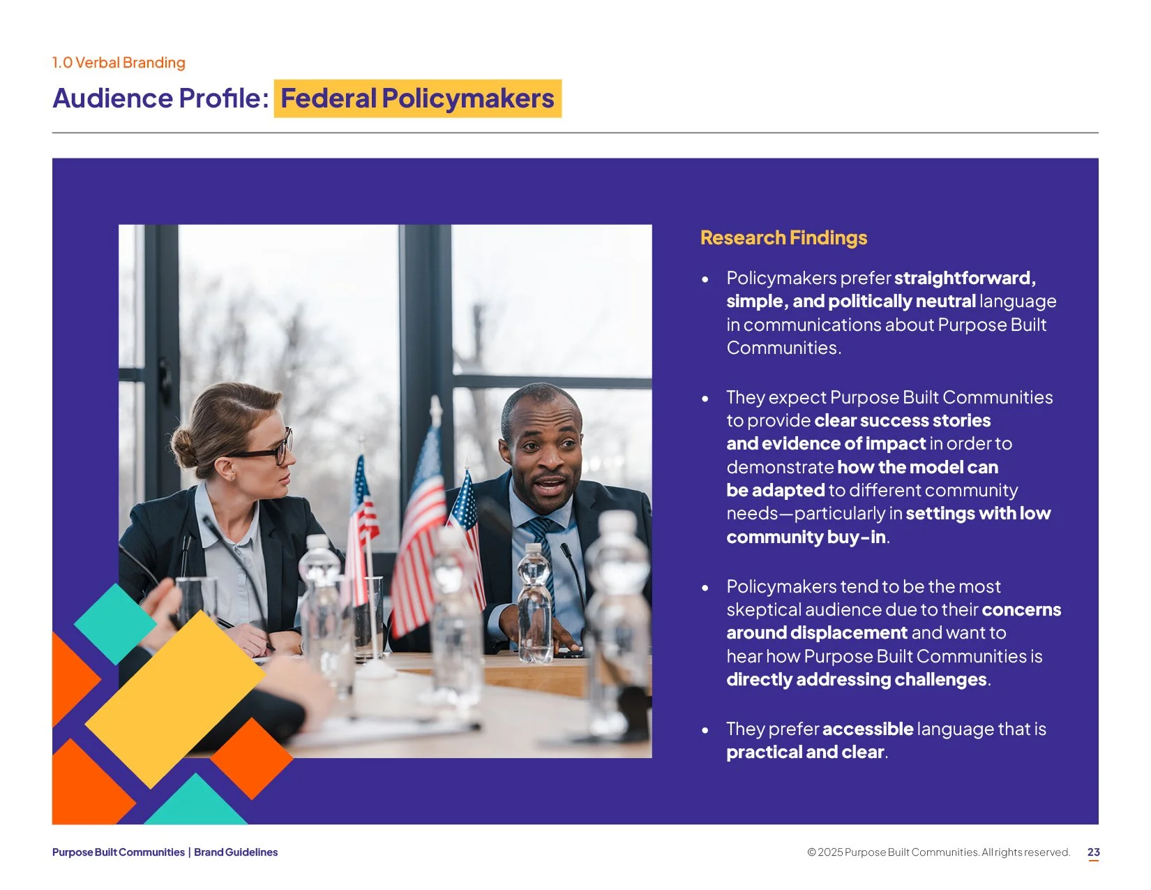
Using data from the qualitative research, we created comprehensive audience profiles for each of our five primary audience groups (Prospective Network Members, Prospective Donors and Funders, Current Network Members, Current Donors and Funders, and Federal Policymakers).
These profiles were detailed summaries that captured the awareness, perceptions, branding preferences, and emotional attachment of our key audiences to inform targeted engagement, messaging, and branding strategies. By developing this deep understanding of our audiences, how they perceive Purpose Built Communities, what they need to hear, and how to effectively engage with them, we then were able to build a branding, marketing, and communications strategy that delivers results efficiently and effectively.
In summary
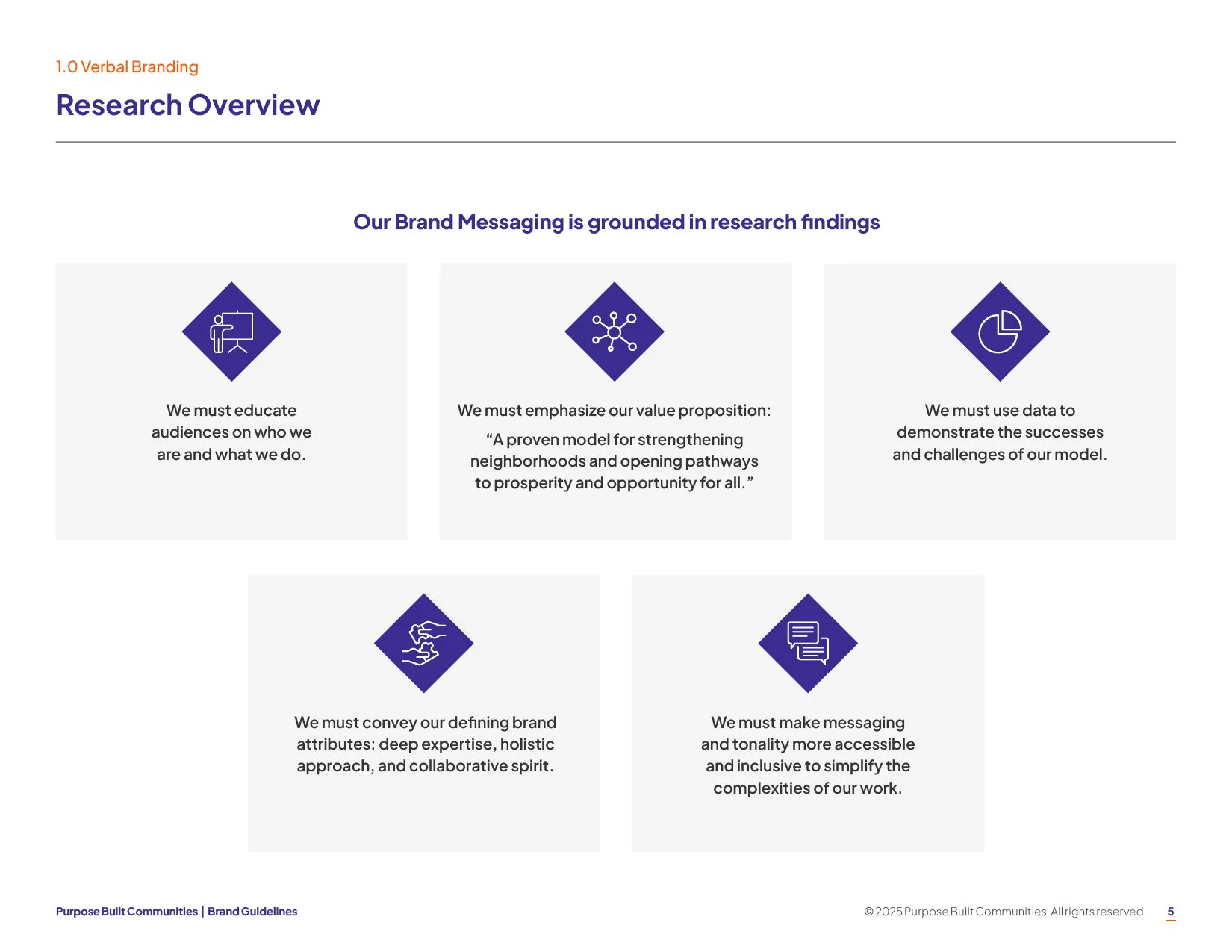
Drawing from all of this research, we identified five key branding considerations that served as the foundation for the entire rebrand:
We must educate audiences on who we are and what we do.
We must emphasize our value proposition, “A proven model for strengthening neighborhoods and opening pathways to prosperity and opportunity for all.”
We must use data to demonstrate the successes and challenges of our model.
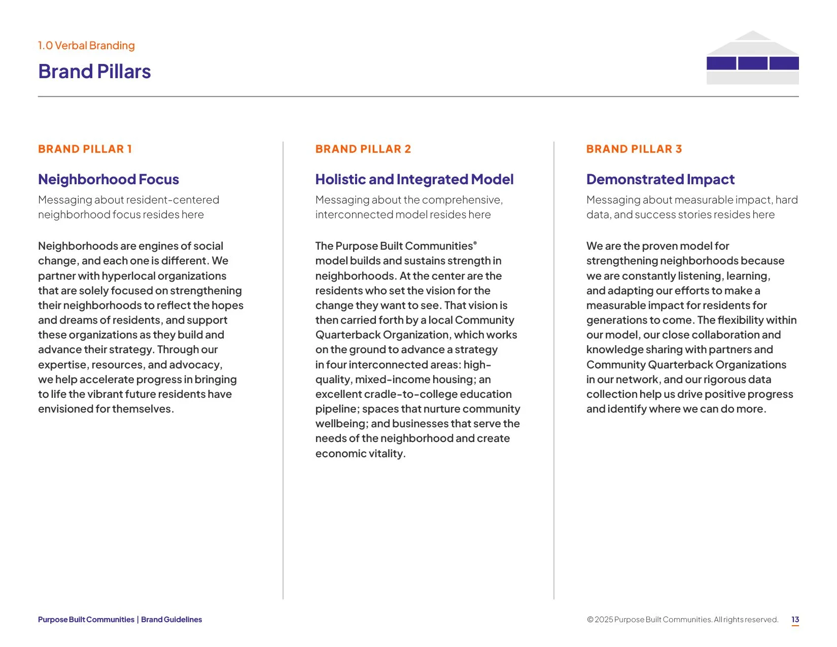
We must convey our defining brand attributes: deep expertise, holistic approach, and collaborative spirit.
We must make messaging and tonality more accessible and inclusive to simplify the complexities of our work.
Branding workshopS
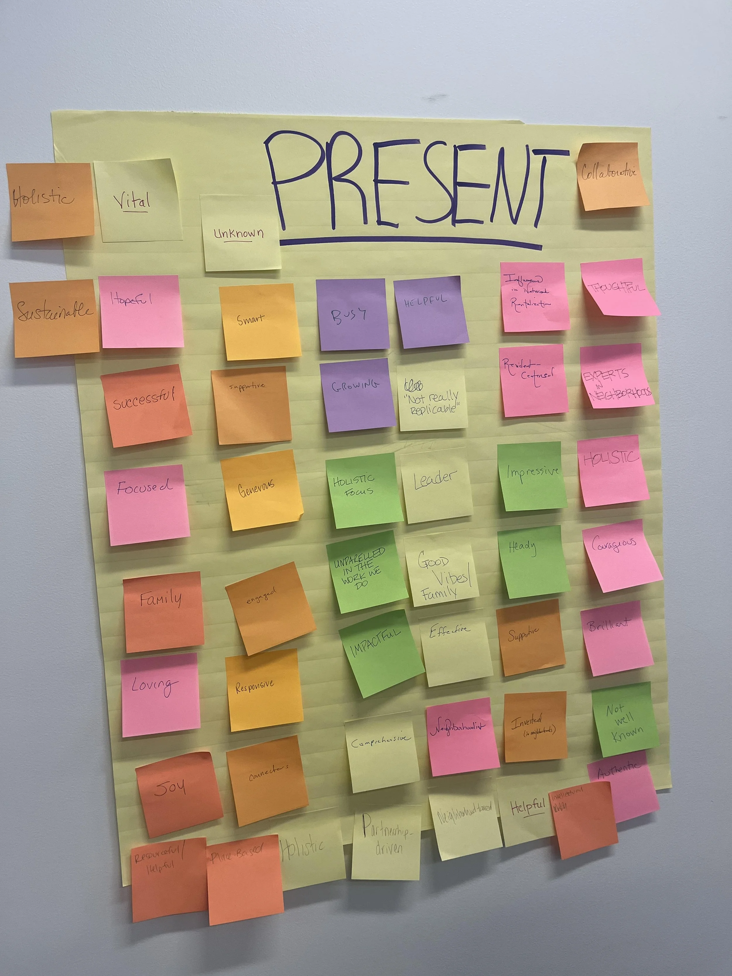
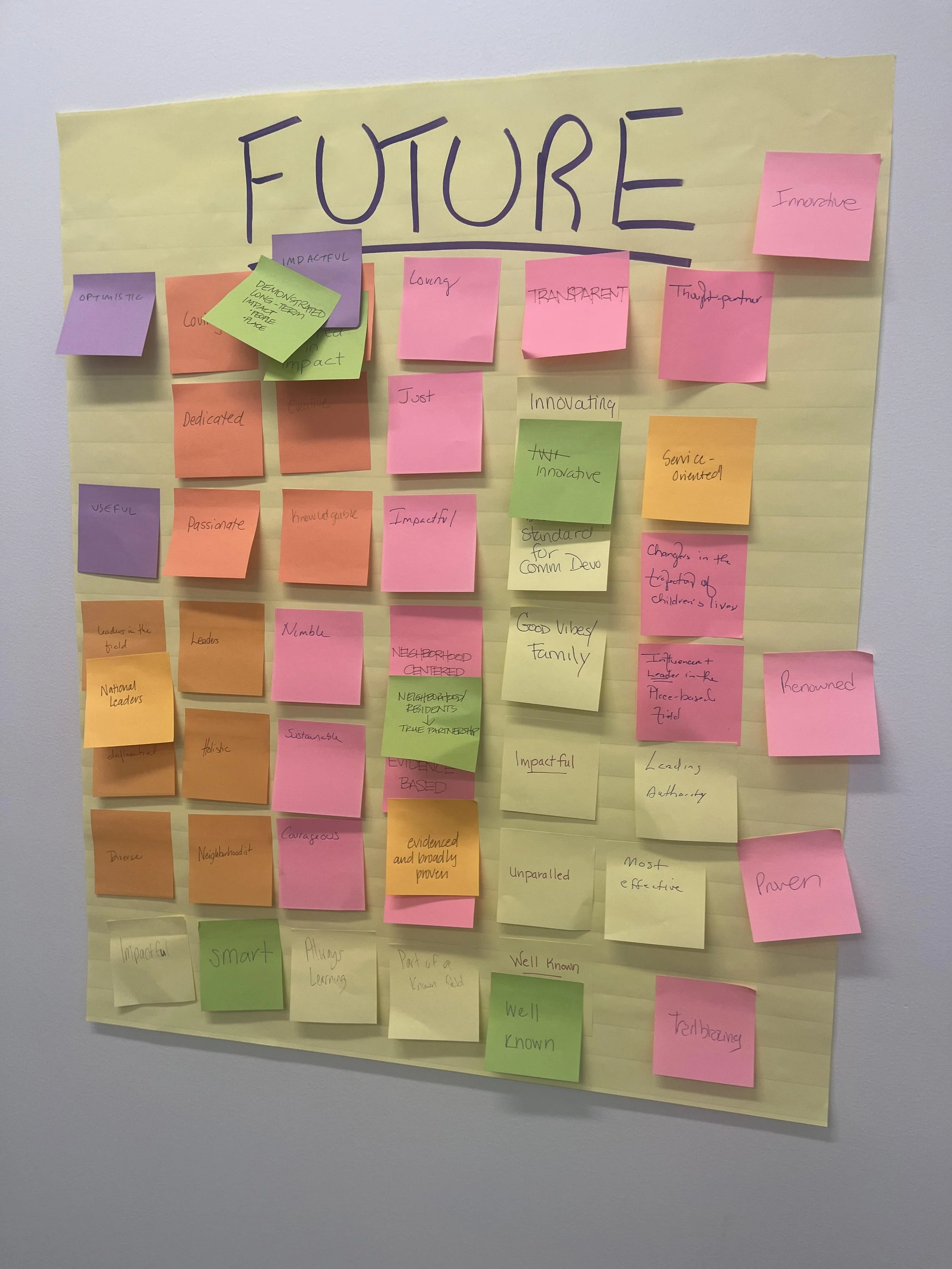
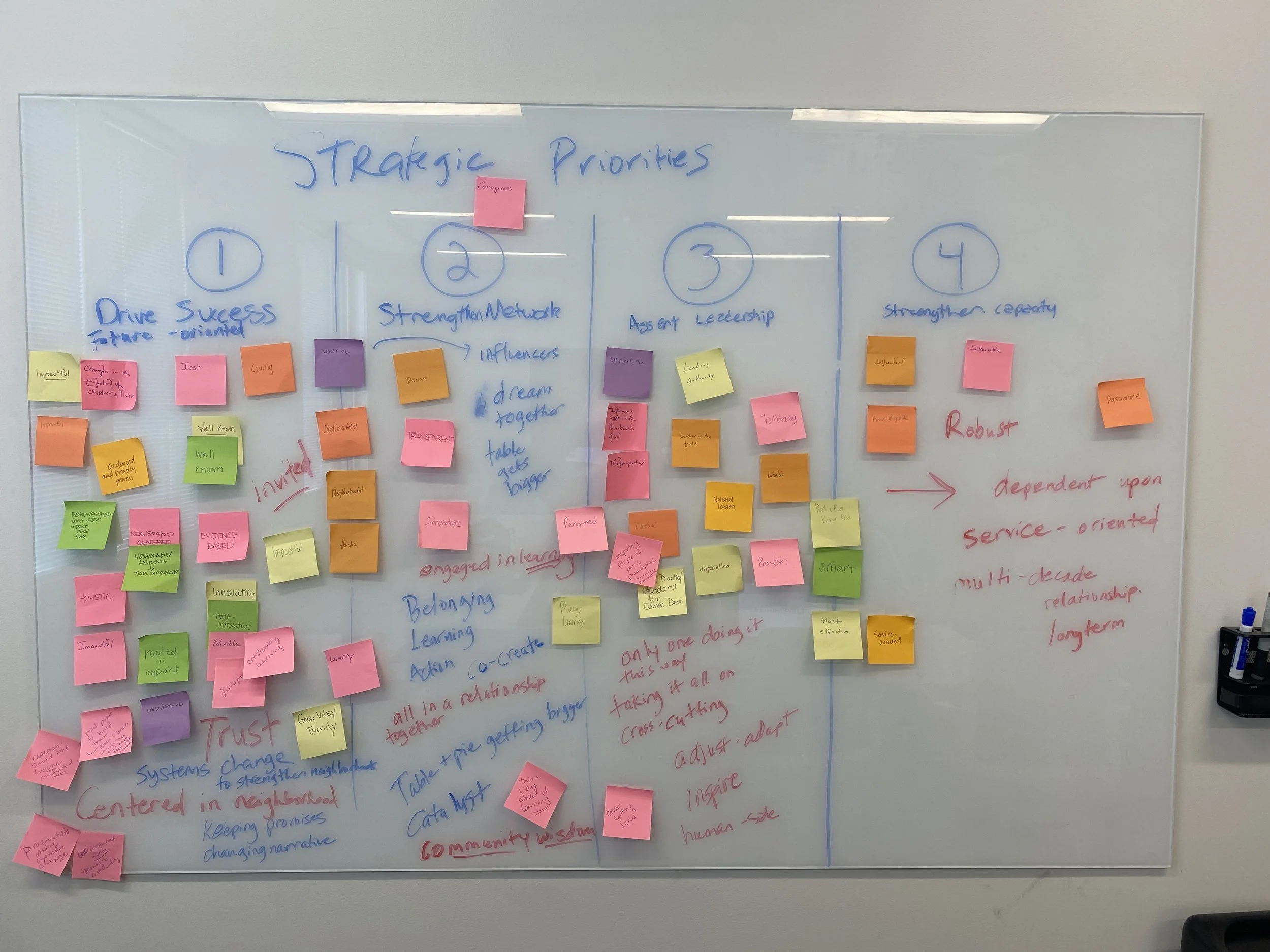
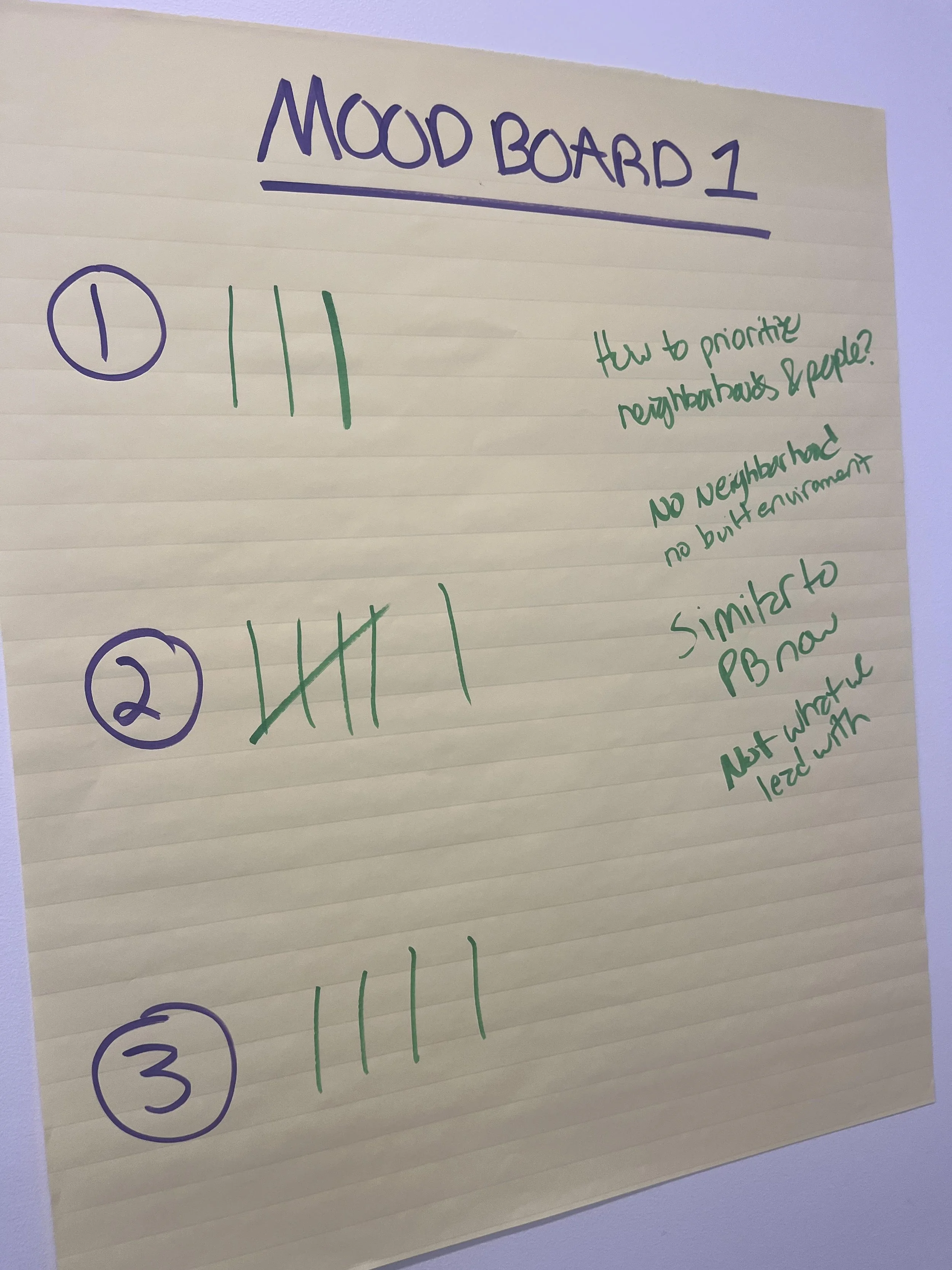
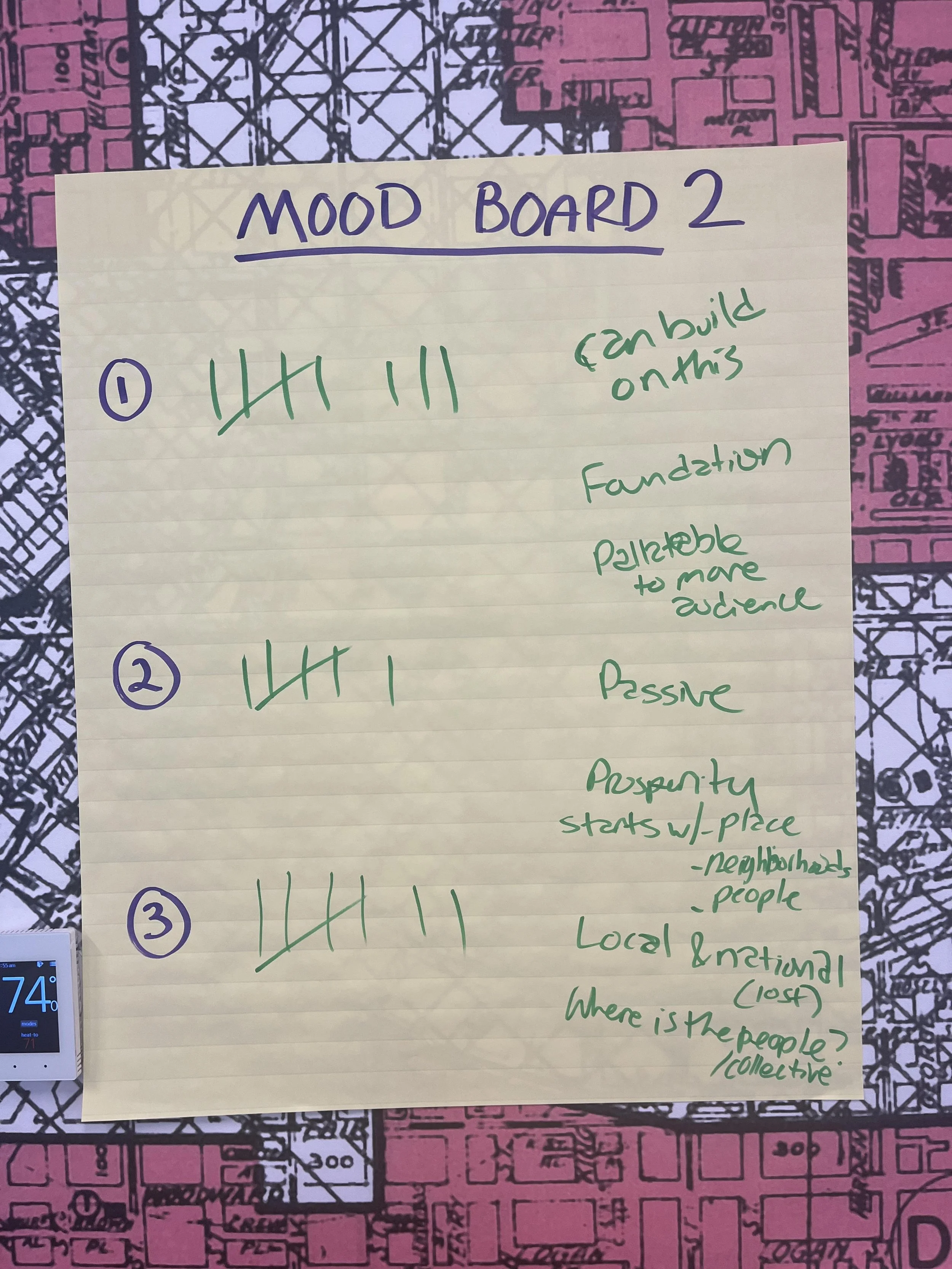
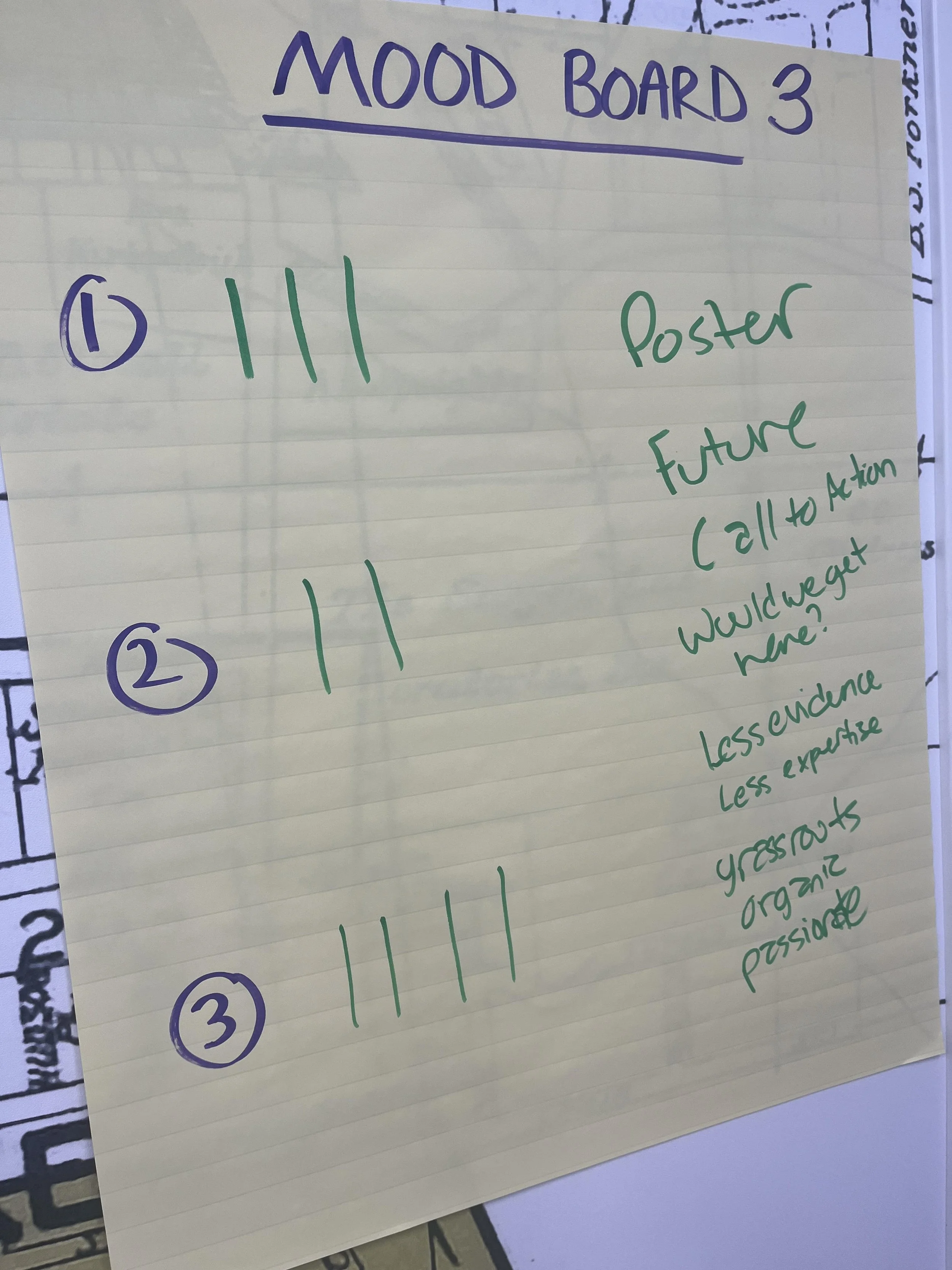
We facilitated a series of branding workshops with Purpose Built Communities leadership and staff to align on personality attributes and initial visual directions. Grounded in research findings, these interactive sessions built consensus around key decisions and provided the strategic foundation we needed to move confidently onto the development of the messaging framework and visual identity.
Creative brief
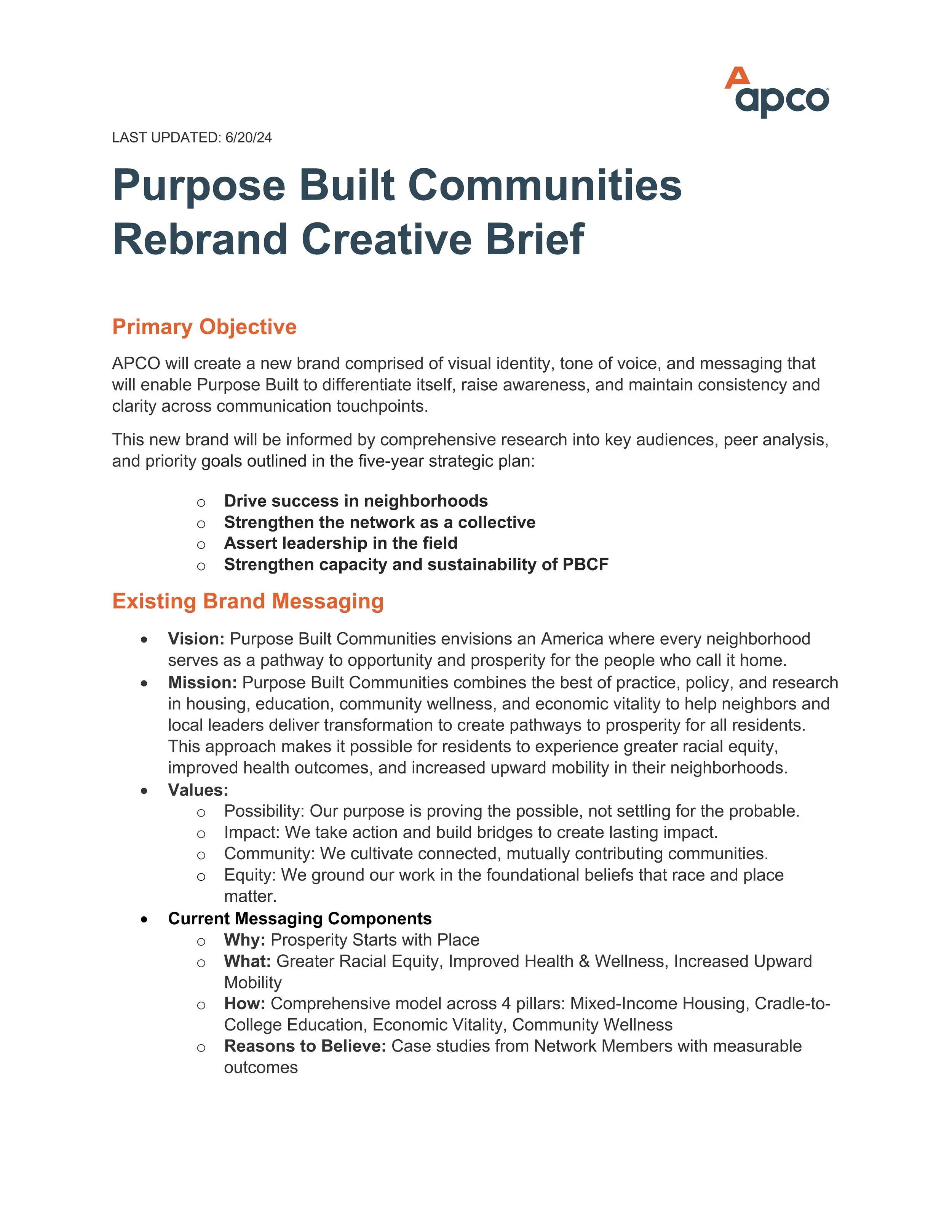
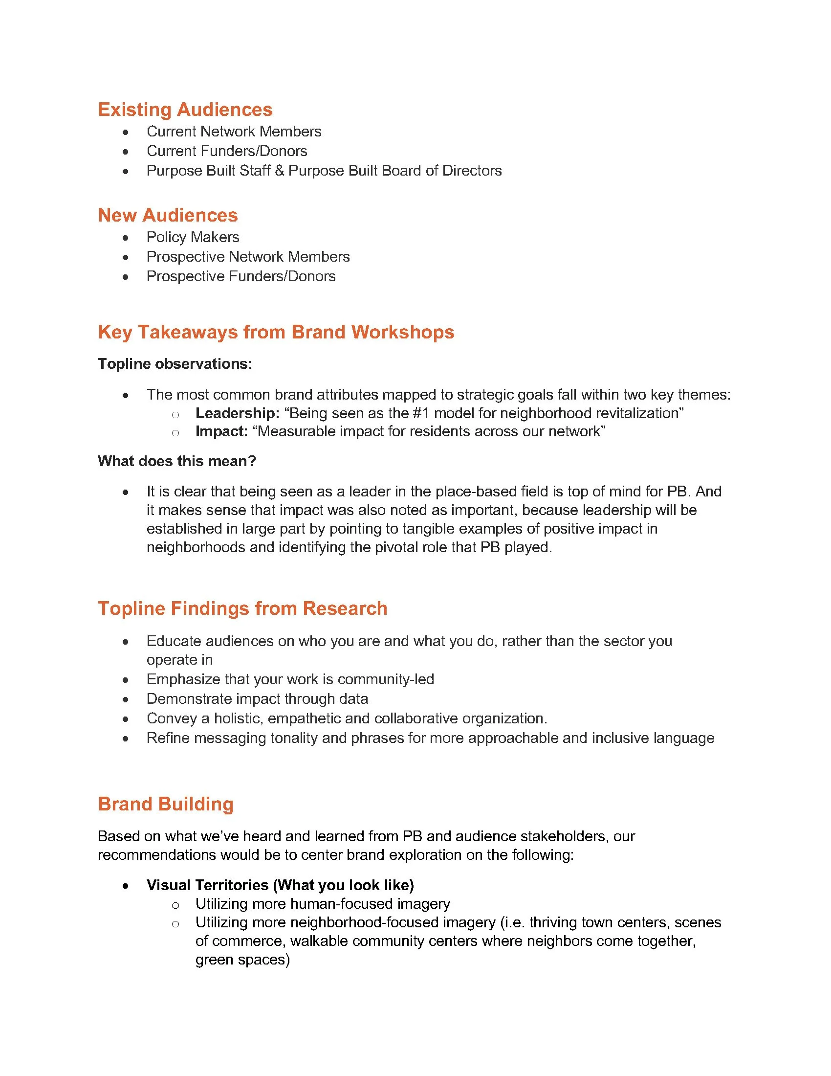
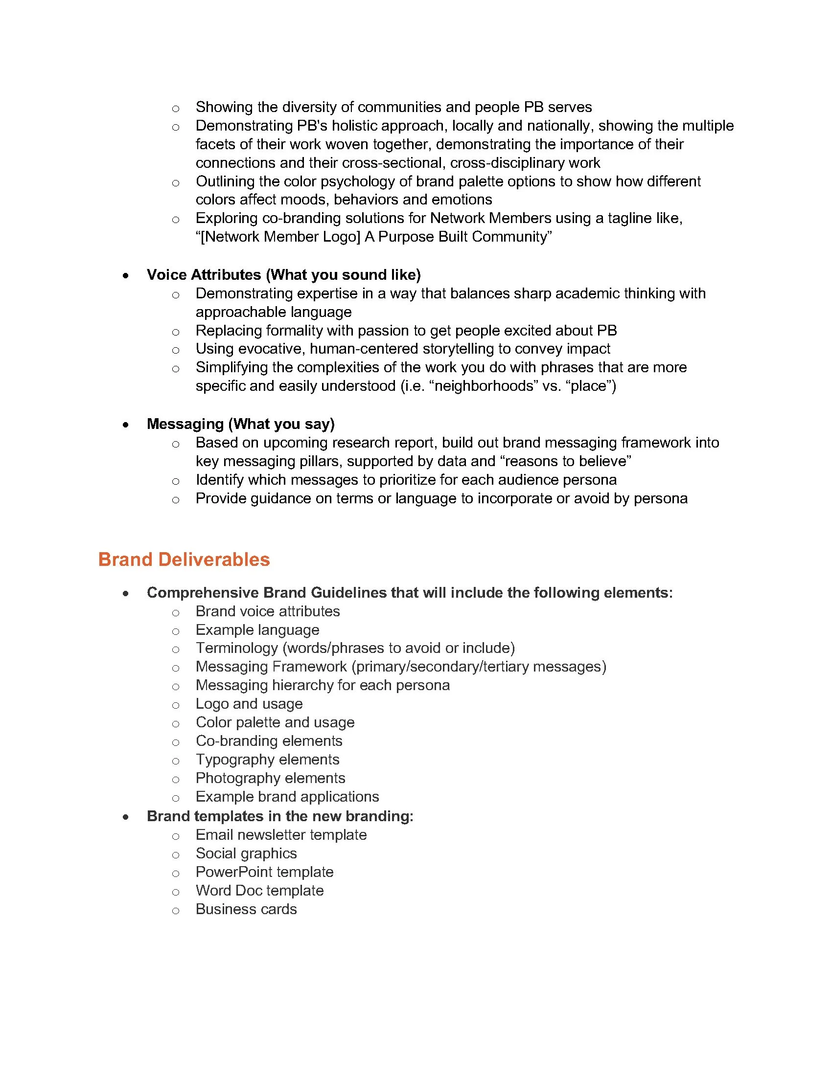
Following the landscape analysis, stakeholder research, and branding workshops, I developed a creative brief that translated audience insights and strategic priorities into a clear roadmap for the rebrand. The brief established recommendations for the visual identity, messaging framework, tone of voice, co-branding approach, and brand deliverables, ensuring every creative decision remained grounded in research and aligned with Purpose Built Communities' long-term goals.
Moodboards
Option 1: The Innovative Exemplar
This direction leans into the role of Purpose Built Communities as the thought leader for place-based revitalization—educational, data-driven, and model-centered.
option 2: the trusted neighborhoodist
This option embodies Purpose Built Communities’ ethos as a community convener and connector—emotive, approachable, and people-centered.
option 3: The Visionary Advocate
This shows Purpose Built Communities as the amplifier of advocacy to influence policy and move the needle for community organizations—confident, resolute, and action-centered.
Logo Development
I collaborated with a team of designers to ideate on logo designs and sample brand explorations using client feedback. We refined our concepts and presented three distinct visual directions, each one offering a different perspective on how the brand could communicate community, opportunity, and impact.
Option 1: Sustainible prosperity
This option represents the unwavering support that Purpose Built Communities establishes with Network Members and Community Quarterback Organizations to ensure that progress is sustained in their neighborhoods. The lowercase typography adds approachability to the brand.
Insights from the Research:
Our audiences used these traits to describe PB as a person: empathetic community member; generous humanitarian; warm, dedicated leader; and trustworthy guide. Imagery included unity, trees, sunshine, and hands coming together.
OPTION 2: Connection Points
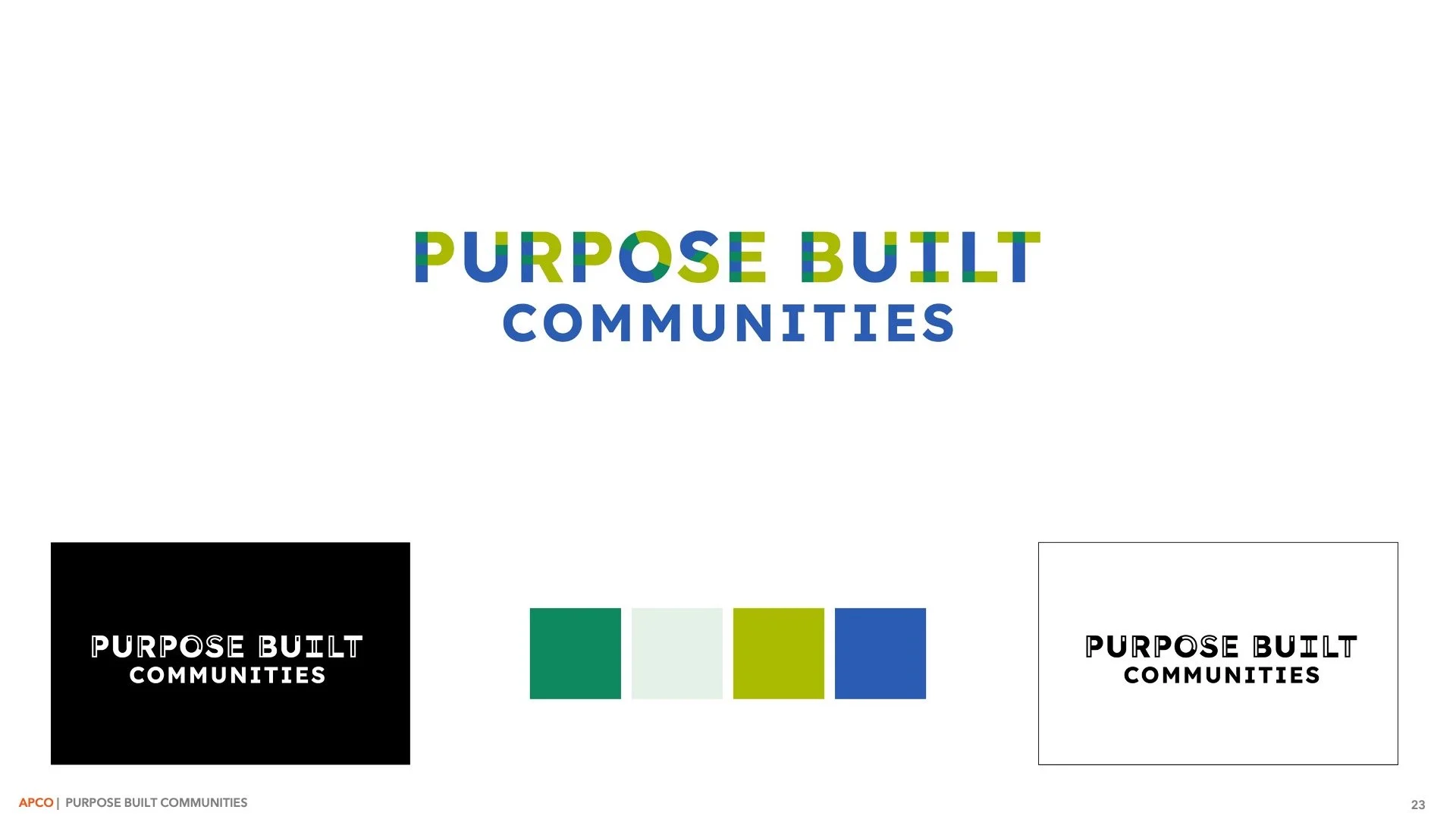
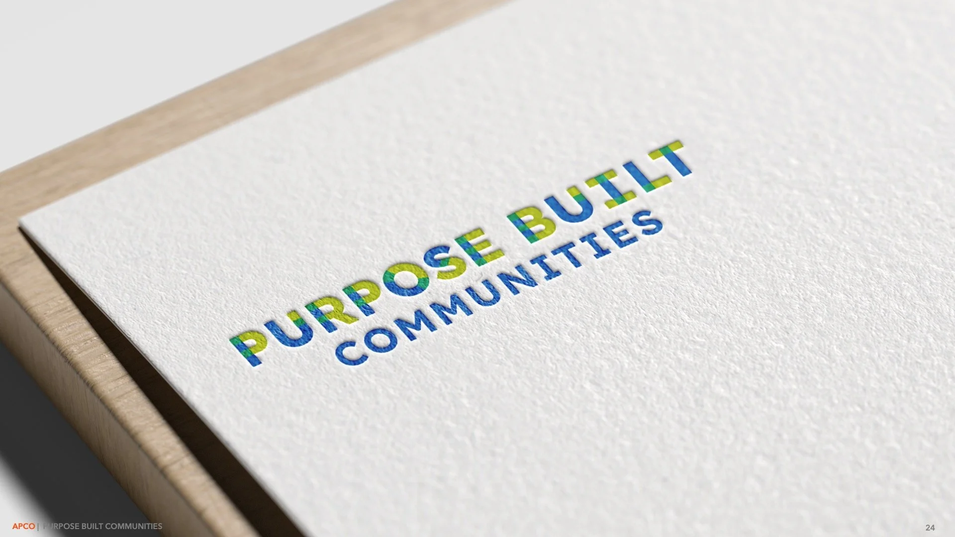
This direction features lettering that changes color where it overlaps, visually representing the idea that the whole is greater than the sum of its parts when it comes to both the Purpose Built Communities model and its relationship with Network Members.
Insights from the Research:
Our audiences used these traits to describe PB as a person: advocate for equality; ambitious changemaker; thought leader; and agile strategist. Imagery included unity and community gatherings.
Option 3: Fabric of Community
This direction uses geometries that weave together to give the effect of a tapestry, showing the interconnectedness and diversity of people who make up the fabric of a neighborhood.
Insights from the Research:
Our audiences used these traits to describe PB as a person: innovative visionary; collaborative team player; community advocate; and practical leader. Imagery included unity; thriving green spaces; community transformation; houses; neighborhoods; and trees.
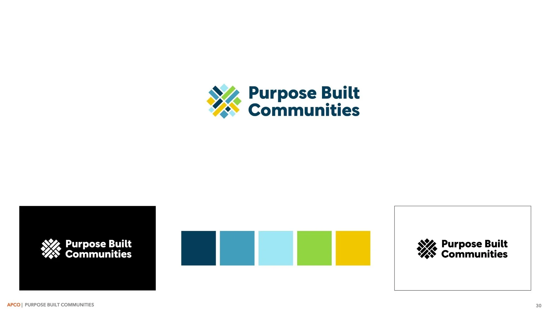
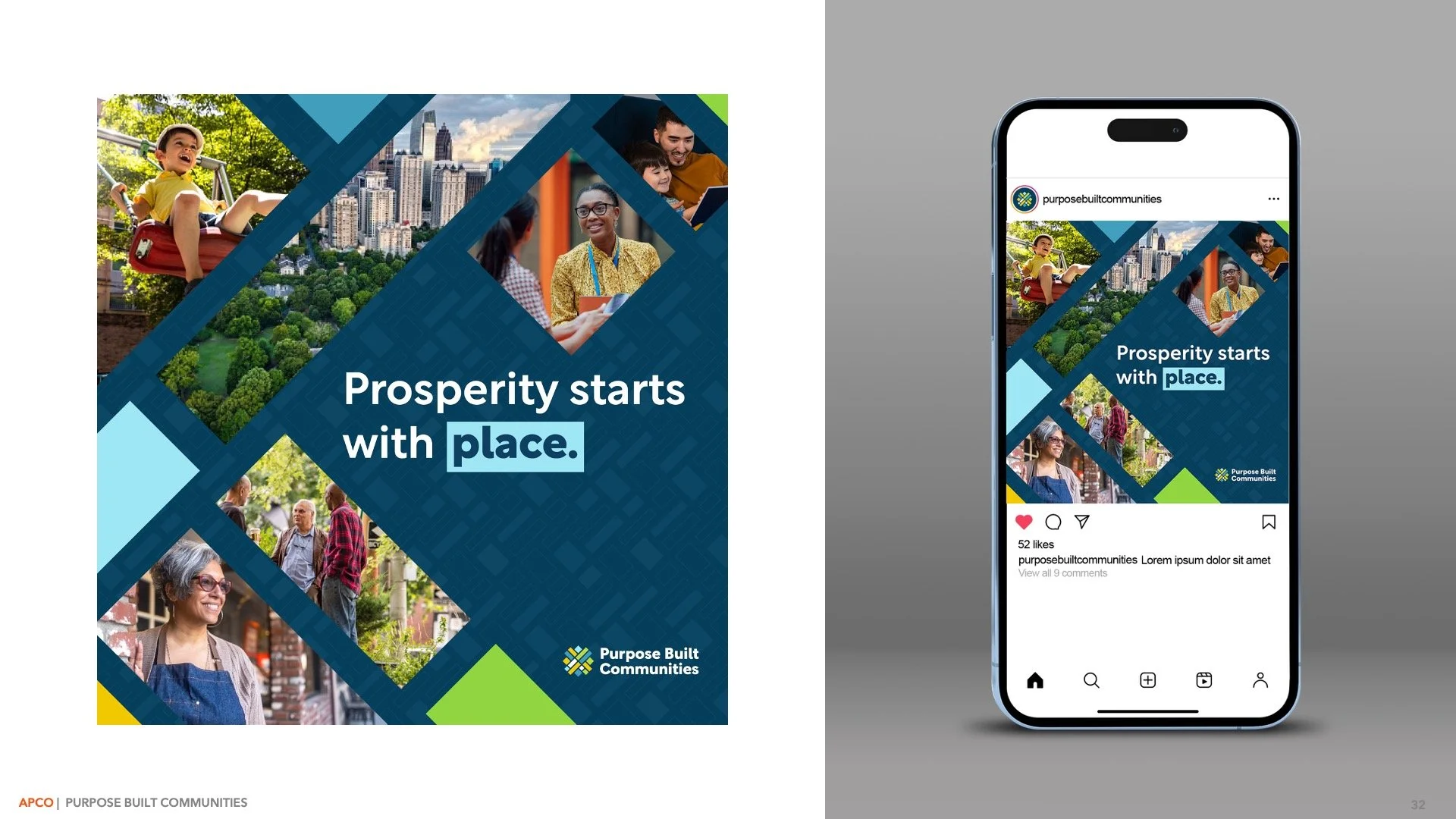
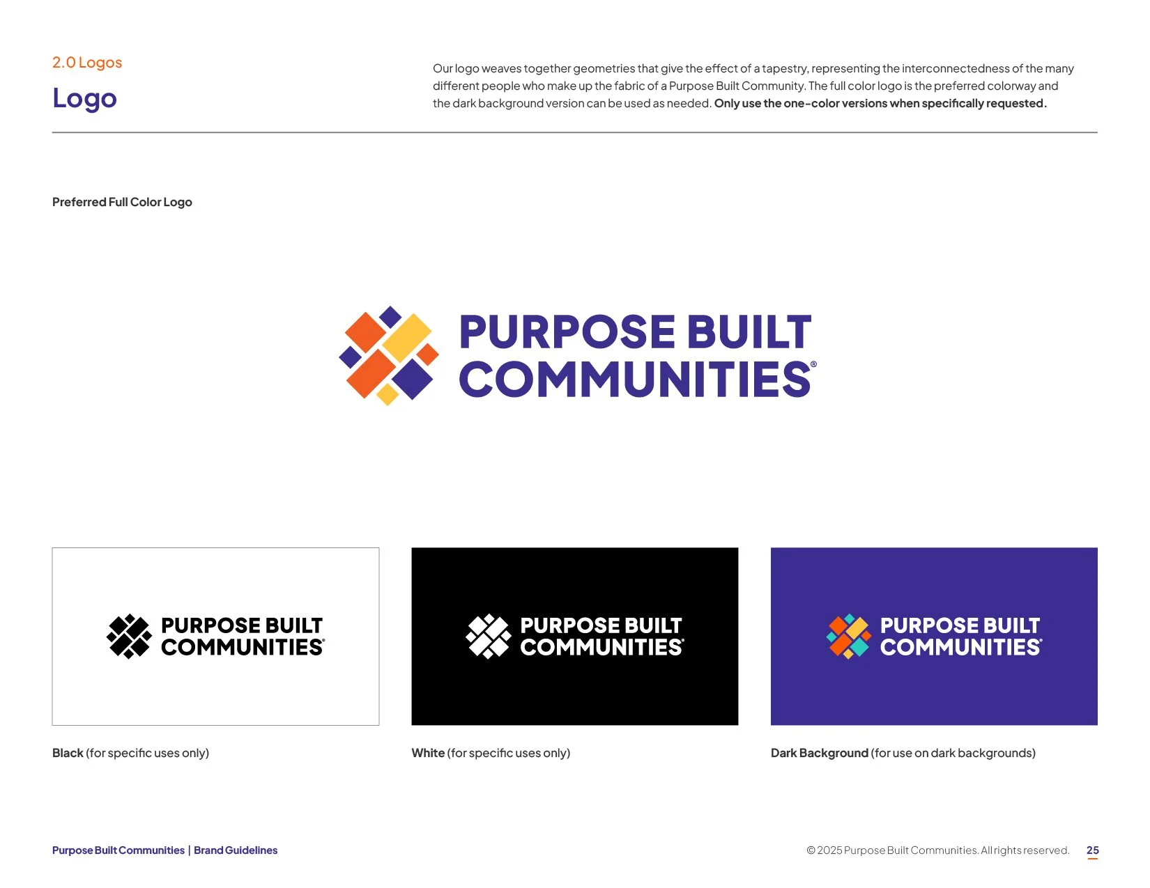
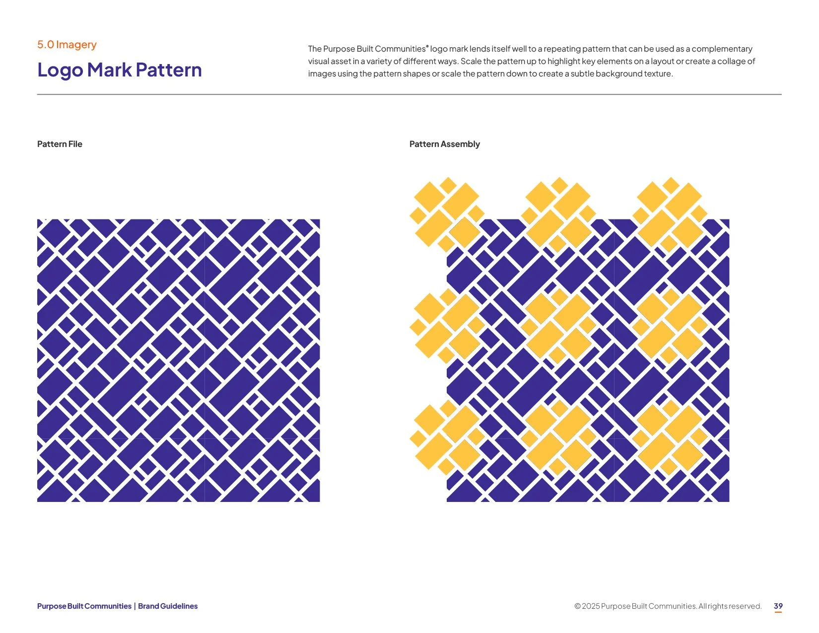
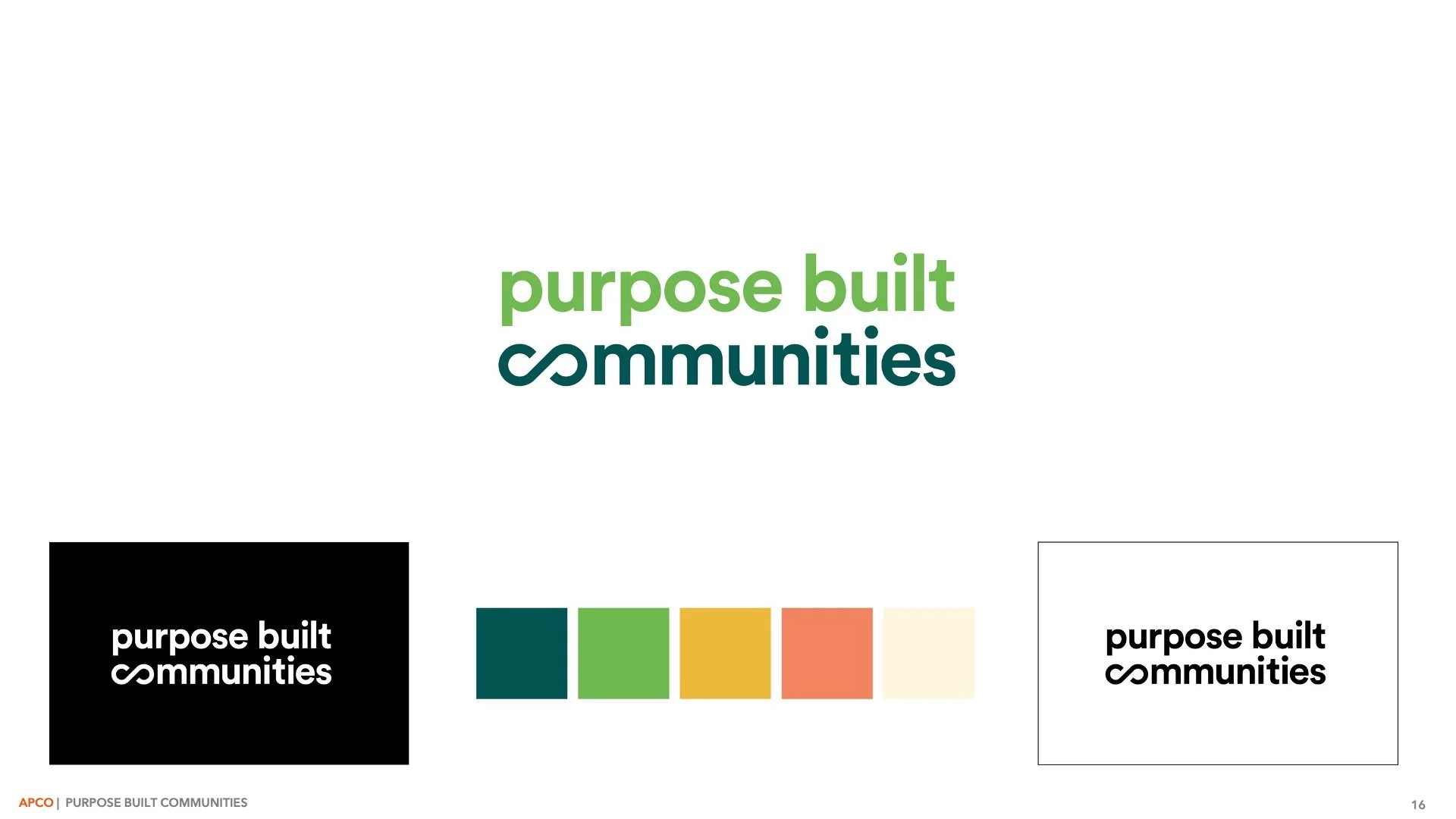
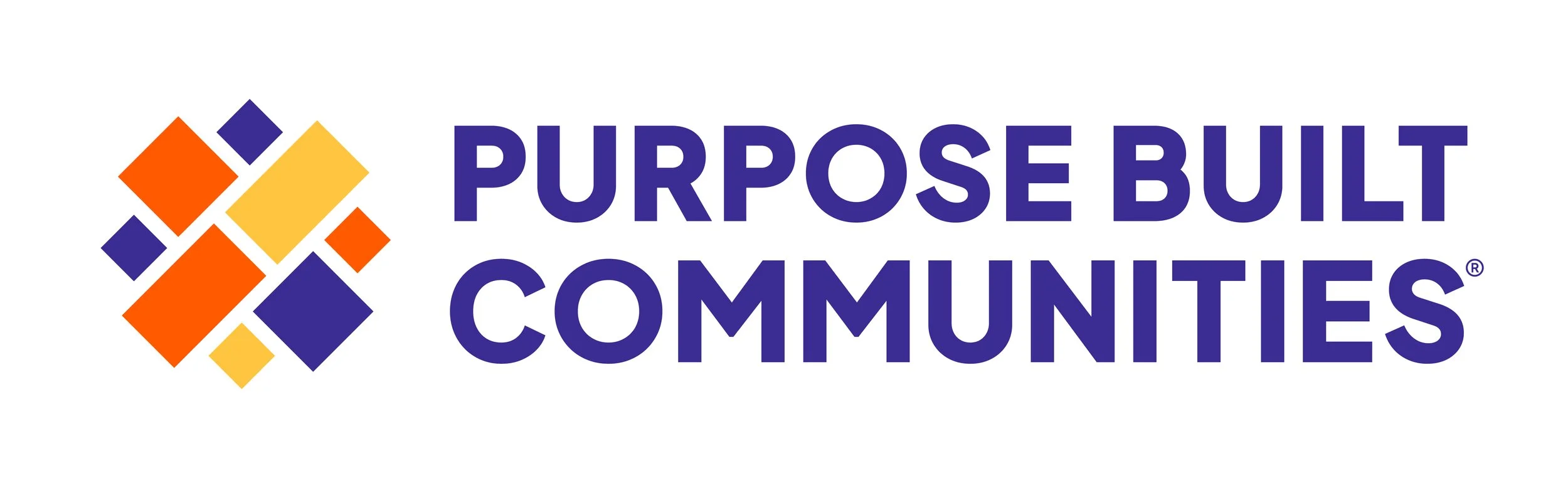
After several rounds of client feedback, the final brand direction was inspired by Option 3: Fabric of Community. The logo was rooted in the exact place where Purpose Built Communities creates impact: the neighborhood. Drawing from an aerial view of Atlanta's street grid, I simplified the map into geometric shapes that reflect the interconnected nature of their work. The mathematically-structured grid represents the expertise of Purpose Built Communities, while a 45-degree rotation adds a sense of momentum and forward progress.
Brand guidelines
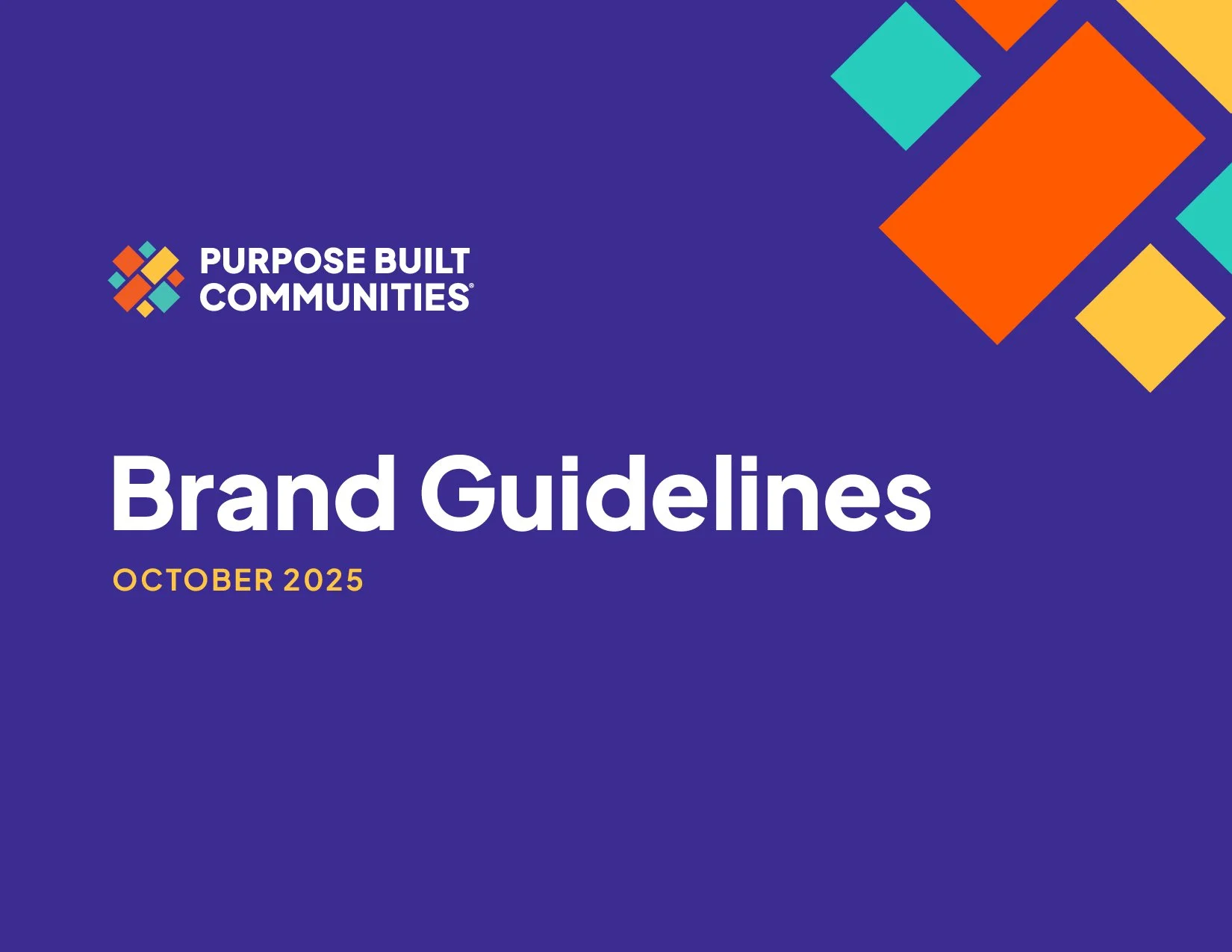
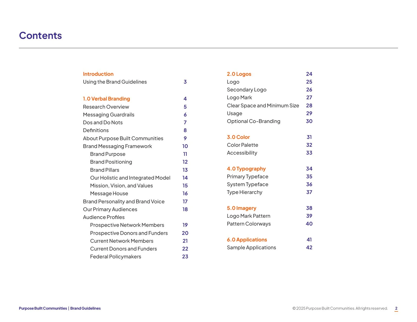
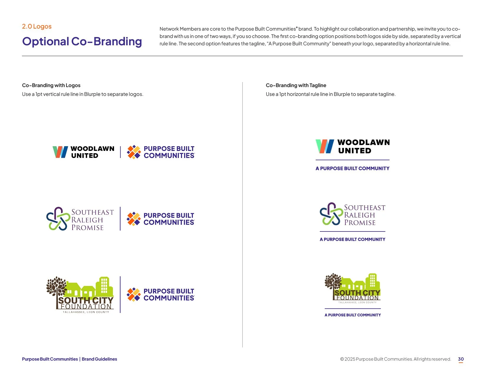
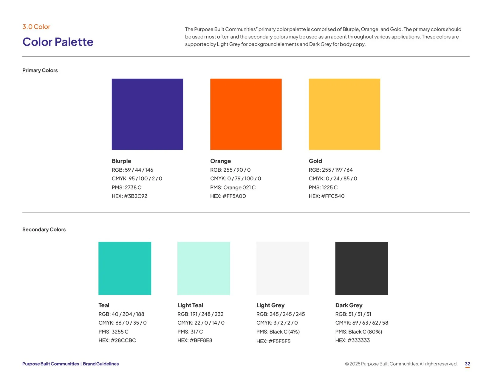
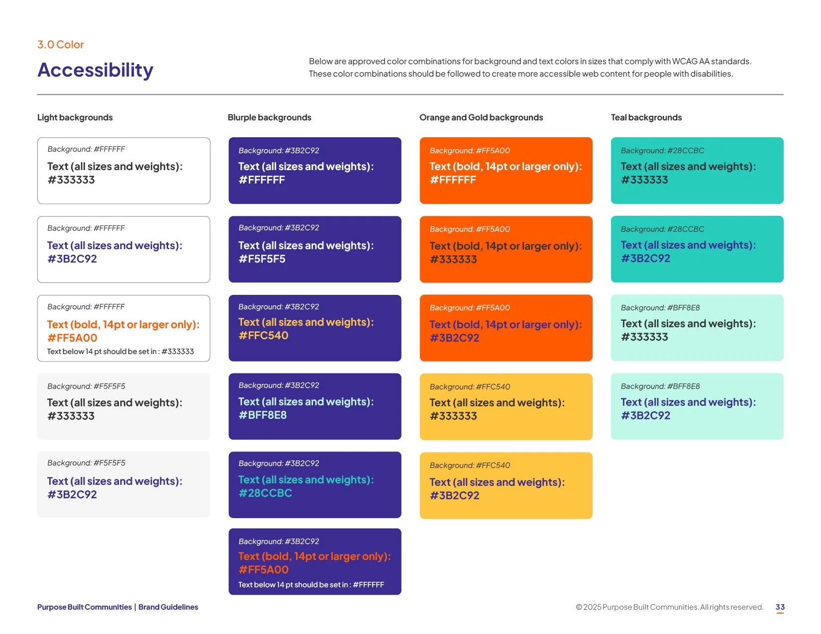
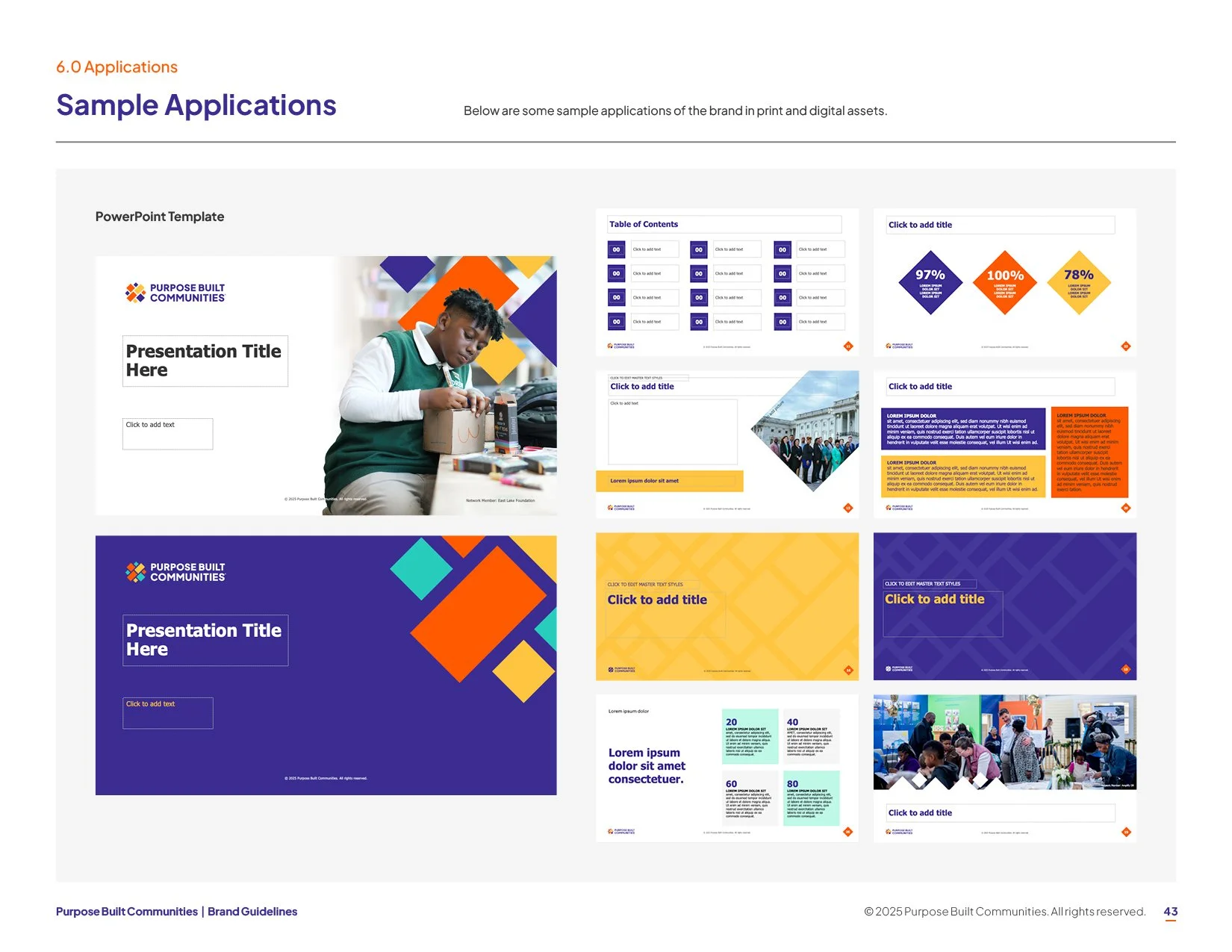
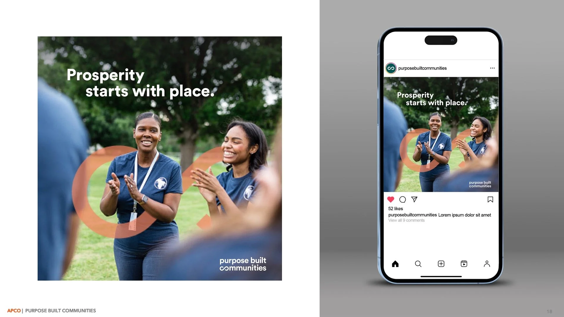
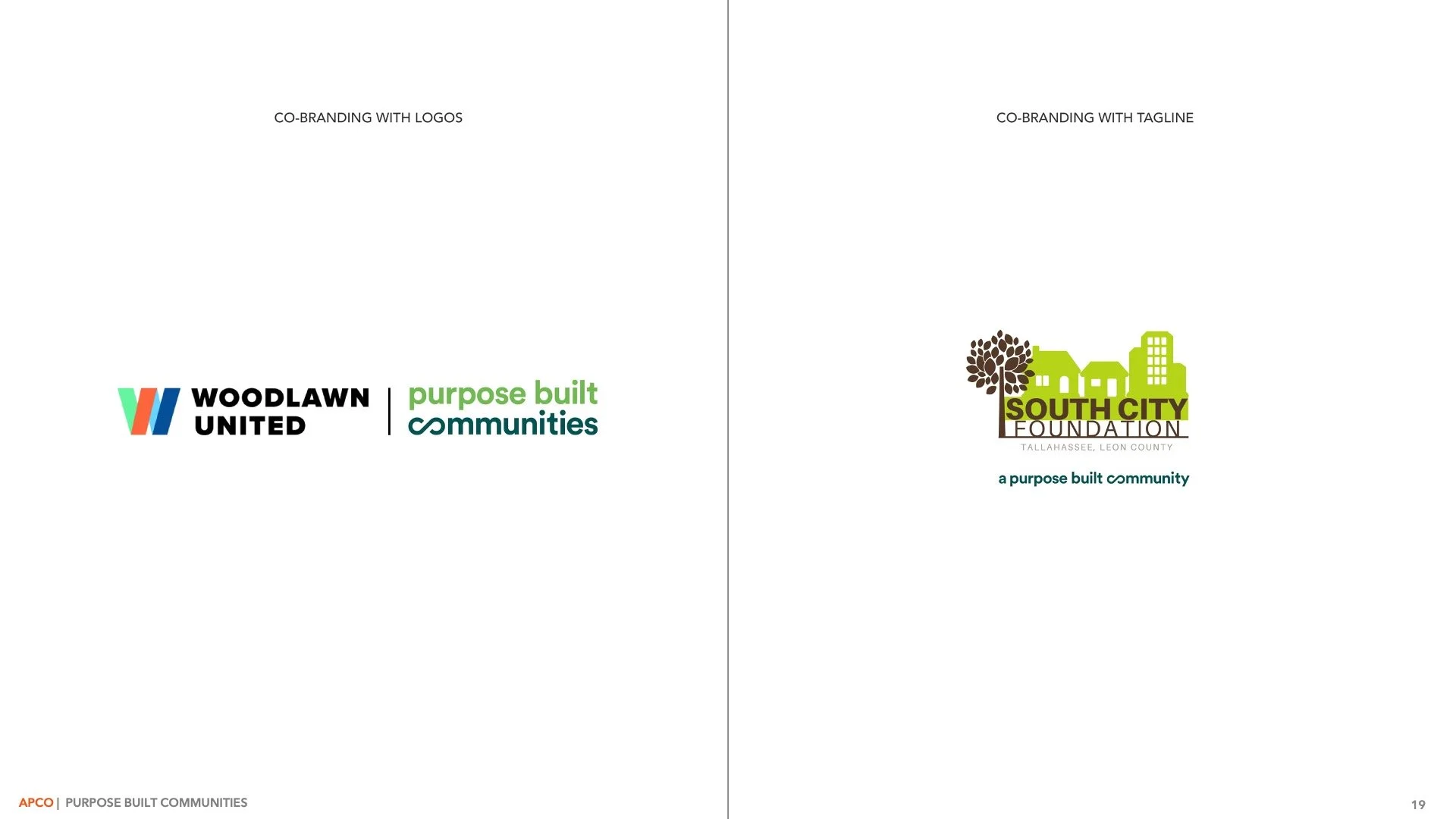
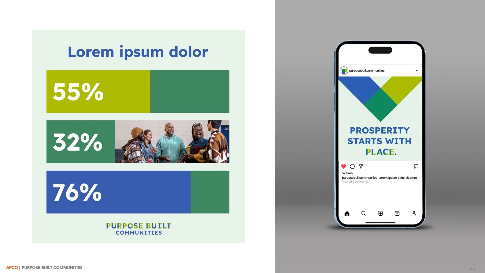
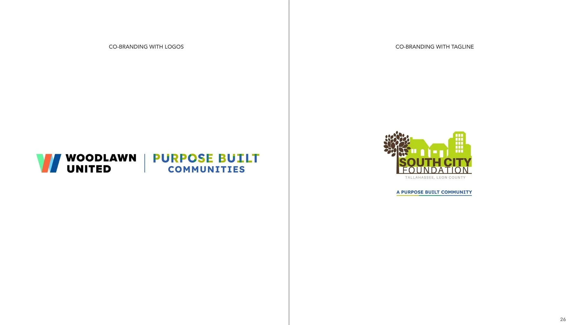
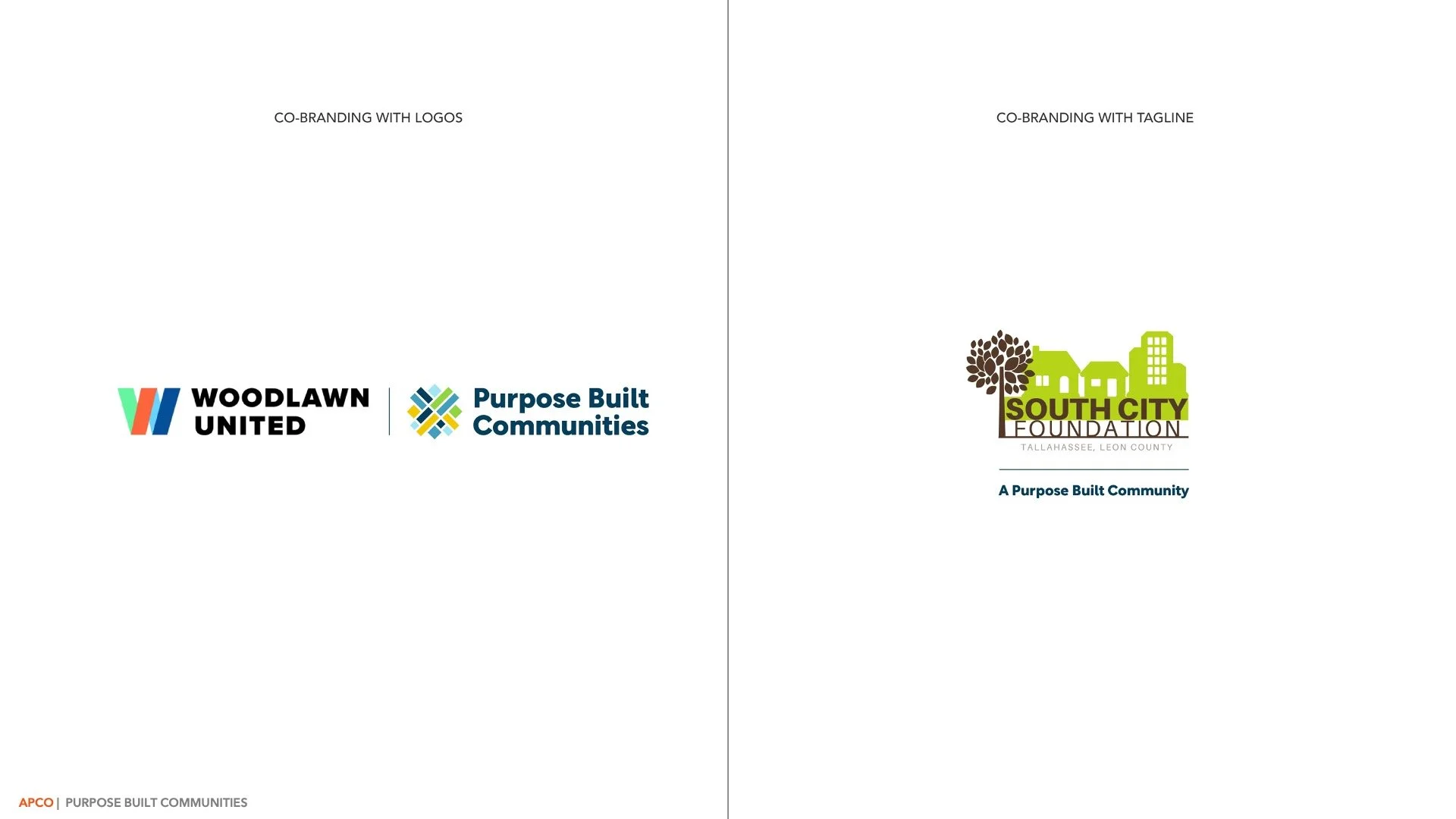
I brought the rest of the brand to life by developing comprehensive guidelines that connected the messaging framework, visual identity, co-branding solutions, and sample applications into a cohesive system. The result was a practical toolkit that empowered Purpose Built Communities and its partners to communicate the new brand consistently while maintaining flexibility across a wide range of audiences and use cases.
Click here to view the full brand guidelines.